An exciting week in the design world has been celebrated with the announcement of the Color of the Year 2025. In addition, Benjamin Moore, a renowned name in the industry, has revealed their 2025 Color Trends Palette, featuring an impressive selection of ten paint shades. A mixture of current design trends and predictive insights, these hues are a portrait of a subtly colorful future for interior decor.
As Hannah Yeo, Benjamin Moore’s manager of color marketing and development, puts it, comforting shades are coming to the forefront following years of color saturation. In 2023, chromatic intensity was the talk of the town. Fast forward to 2024, and we saw a toning down of intense shades. The leading trend for 2025 is comfort and a sense of coziness. These shades reflect warmth and a familiar quality that one can’t help but be drawn to.
The palette has been crafted with reliability and timelessness in mind. Each color stands strong on its own, but they all harmoniously blend together. This is particularly beneficial when applying hues throughout the home, creating a seamless visual journey from one room to the next.
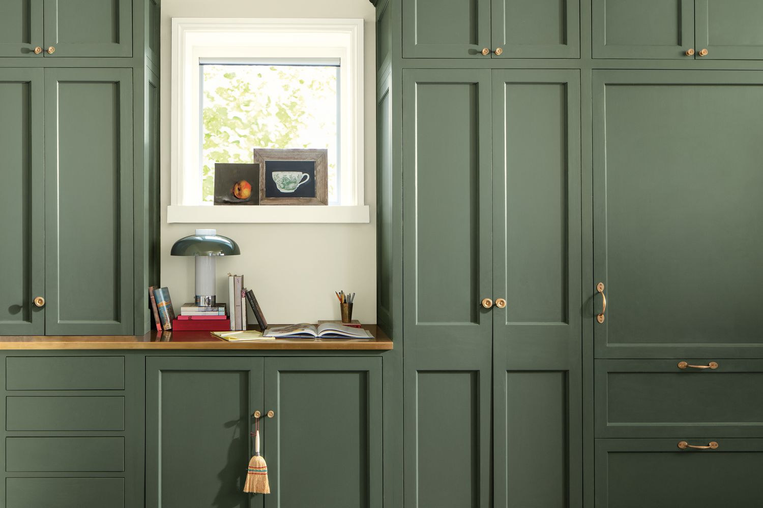
The 2025 Color Trends Palette includes a range of hues. Rosepine, a rich green shade, adds a splash of boldness to kitchen cabinetry brightening up a room with its touch of sunshine. For those aiming to veer away from traditional grays, Paris Rain, with a hint of green, proves to be a stunning choice that feels extra special.
Sea Salt, meanwhile, manifests versatility through complexity. It can express different shades under various lighting conditions, becoming more nuanced based on the source of light. Glacier White shines through with its sense of serene tranquility. Setting itself apart from stark whites, it adds a touch of creaminess that feels inviting.
Stained Glass further captures the variety of colors one can experience. Similar to Sea Salt, it is a compilation of many pigments offering a wide scope of possibilities, especially when paired with different wood tones. Even the resurgence of brown in shades like Leather Saddle Brown and Chowning’s Tan adds a timeless feel. Coupled with the right elements, they can easily transform a formal space into a cozier place.
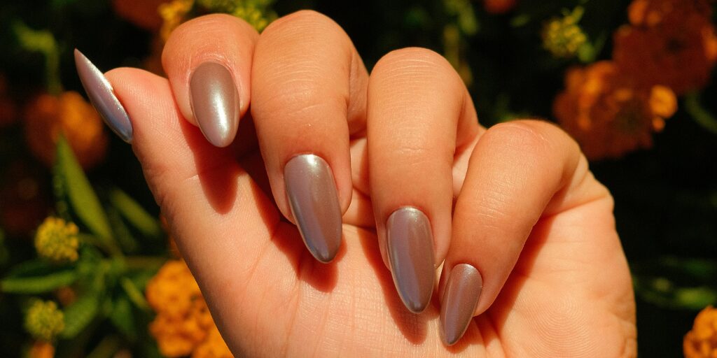
Tissue Pink also deserves a special mention as an extremely flexible hue that adds a dash of warmth to a room. Cinnamon Slate, the distinct Color of the Year 2025, is an intriguing mingling of heather plum and velvety brown. It displays adaptability, flitting from being brown, plum, or even gray, and makes an excellent neutral shade. Finally, Ashwood Moss offers an alternative to black with its deep saturation. Its mossy green inspires comfort and power, making it a top choice for upcoming design ventures.
In conclusion, the Color Trends Palette for 2025 from Benjamin Moore is a roadmap to understanding the upcoming direction in the realm of interior decor. With a panoramic spread of 10 unique shades, it showcases the beauty in adaptability, harmony, and timelessness. Whether you’re awash in elegant brown or captivated by a pink blush of warmth, your home’s interior in 2025 will be quiet, comforting, and cool—the embodiment of a color revolution!


